samantha@pushthepixels.com // 423-782-8479 // LinkedIn
Branding
Social & Print Design
Web Design
The Golden Trailer Awards is a night of entertainment dedicated to highlighting the best in entertainment advertising, including trailers, movie posters, and more.
For the 21st annual event, the show moved to a hybrid broadcast live from Tennessee, streamed to Los Angeles and beyond. I was asked to create a brand to reflect this unique year while continuing the elegance of the event’s history.
The team decided to go with an art deco theme focused on champagne bubbles, and I love the result. Shoutout to the talented Jacy Richardson who really made everything come alive with her fantastic animations. Big big thanks to Sync Space and GTA for this one, it was a blast! 🥂
My husband, sister, and brother-in-law came with me to the event. We had a great time!
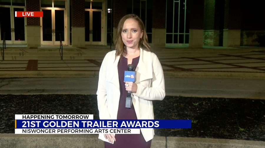
Read the Full Article by WJHL

Read the Full Article by Trending Today
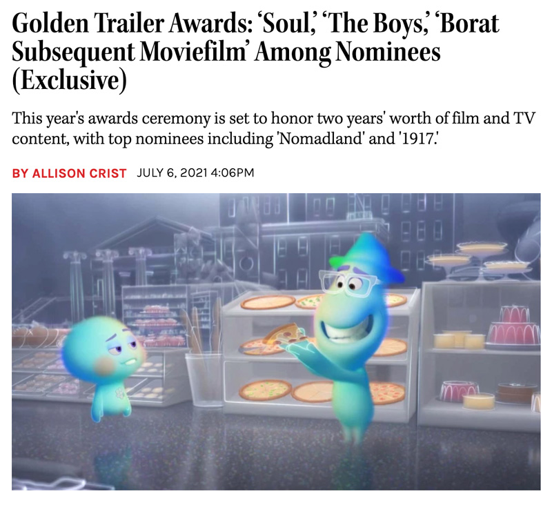
Read the Full Article by The Hollywood Reporter
Illustration
Mural Installation
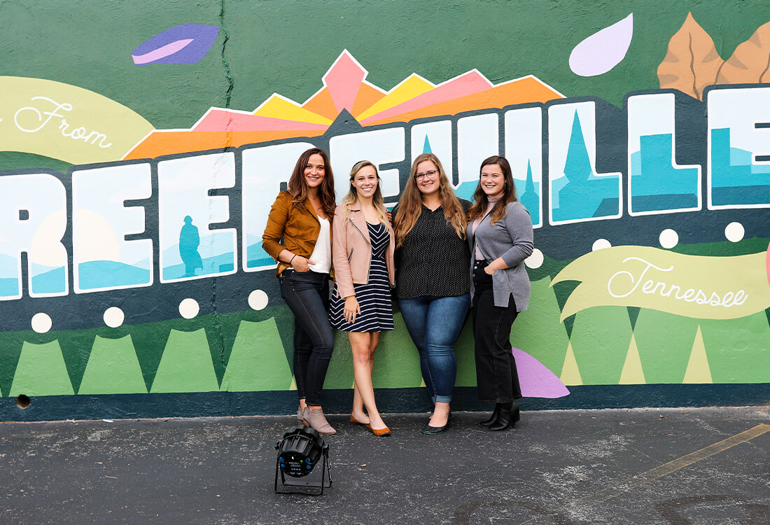
Nestled in the heart of Tennessee, Greeneville is a beautiful town, rich with history, culture, and the welcoming atmosphere that the south is so well known for.
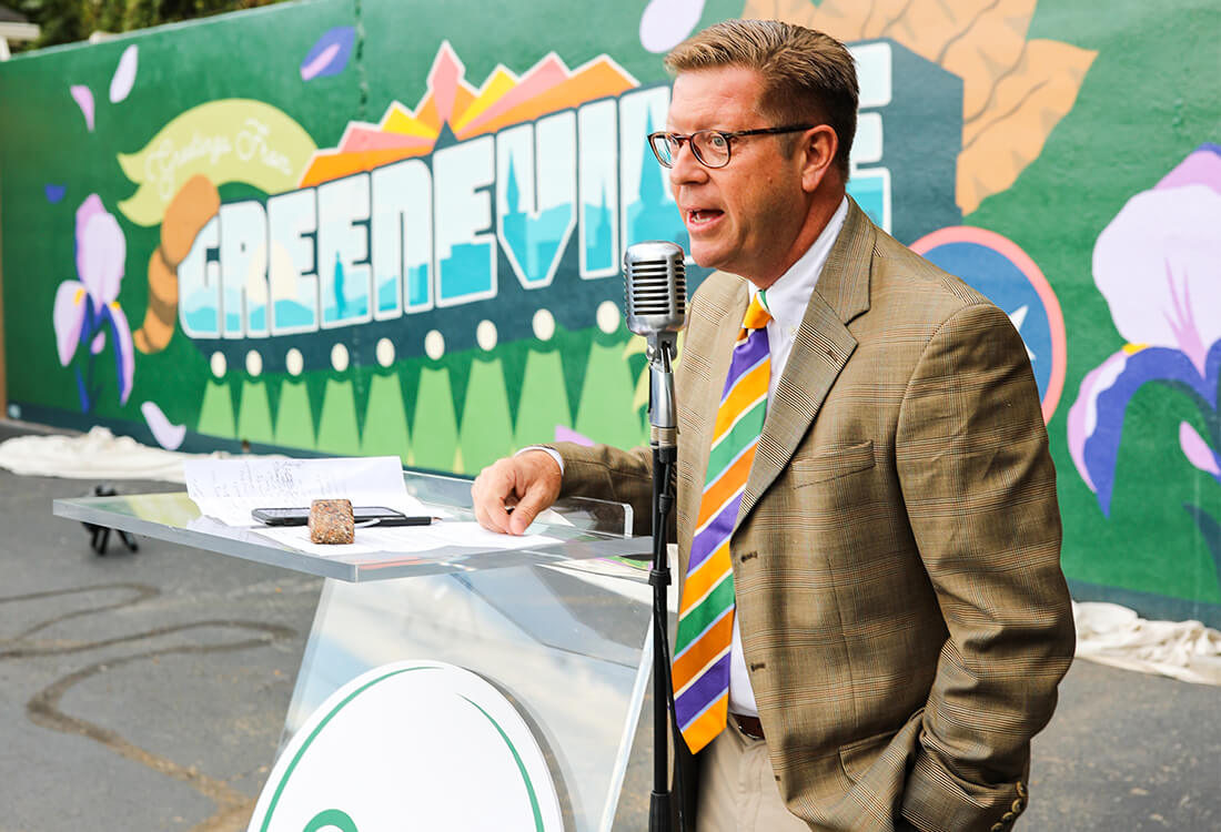
ARO was approached by the Greene County Chamber of Commerce to discuss marketing strategies to promote their beautiful town. One of these ideas was a new mural, and that’s my cue. 🤩
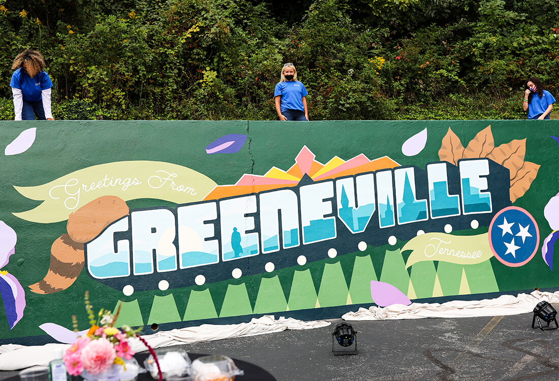
We all decided on a vintage postcard style, with the tagline “Greetings from Greeneville.” While designing the mural, I aimed to capture several different elements from the town’s history. There is a town silhouette including all of the historic chapels, elements of the theatre located right downtown, Andrew Johnson is proudly standing looking over the horizon, and there’s even a Davy Crockett hat to top it all off.
By combining the old with a fresh, modern style, we have a beautiful mural that the whole town can enjoy.
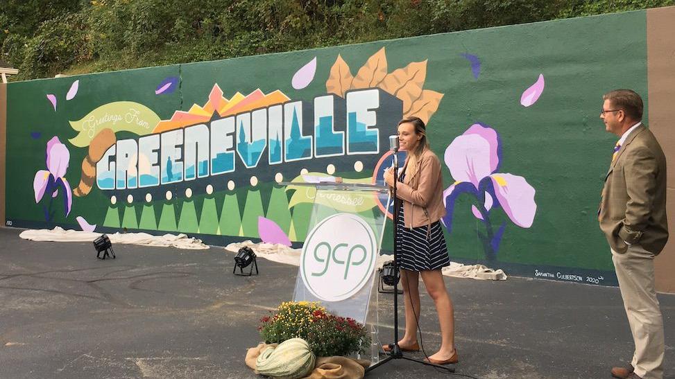
Read the Full Article by the Greeneville Sun
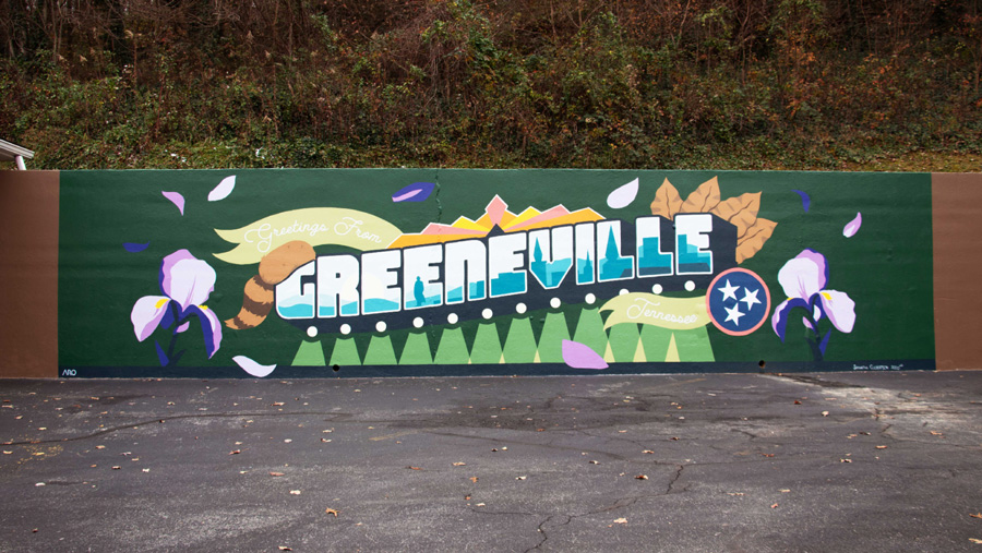
Read the Full Article on WJHL
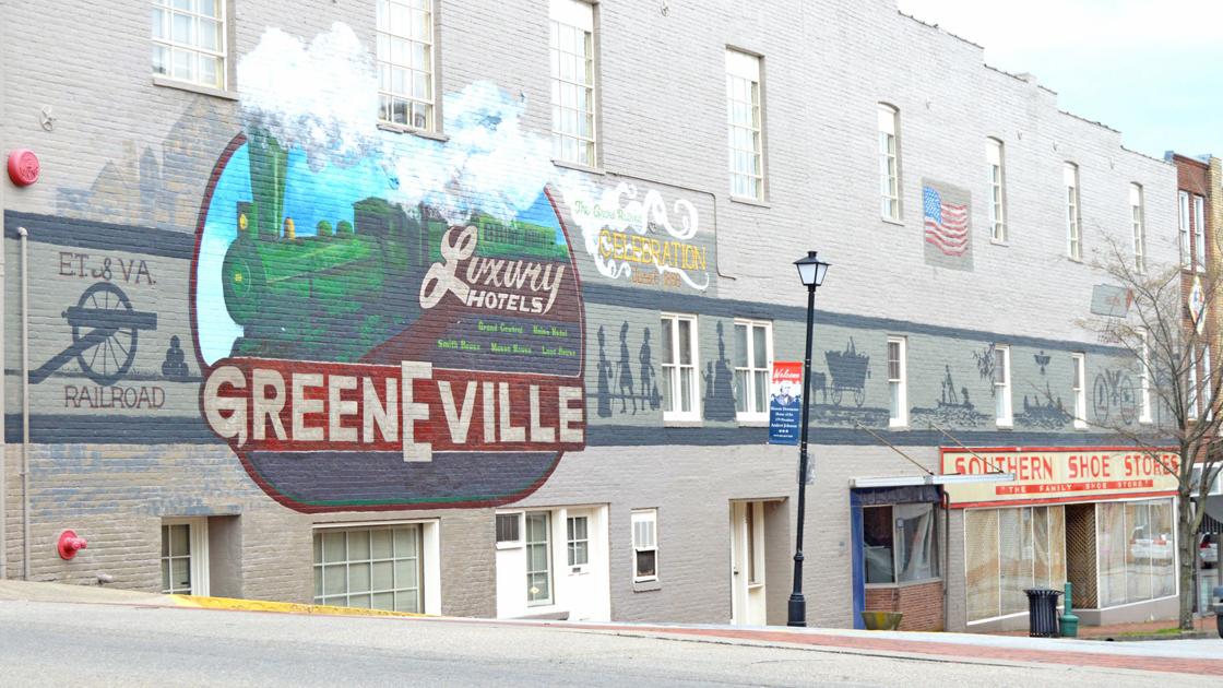
Read the Full Article by the Greeneville Sun
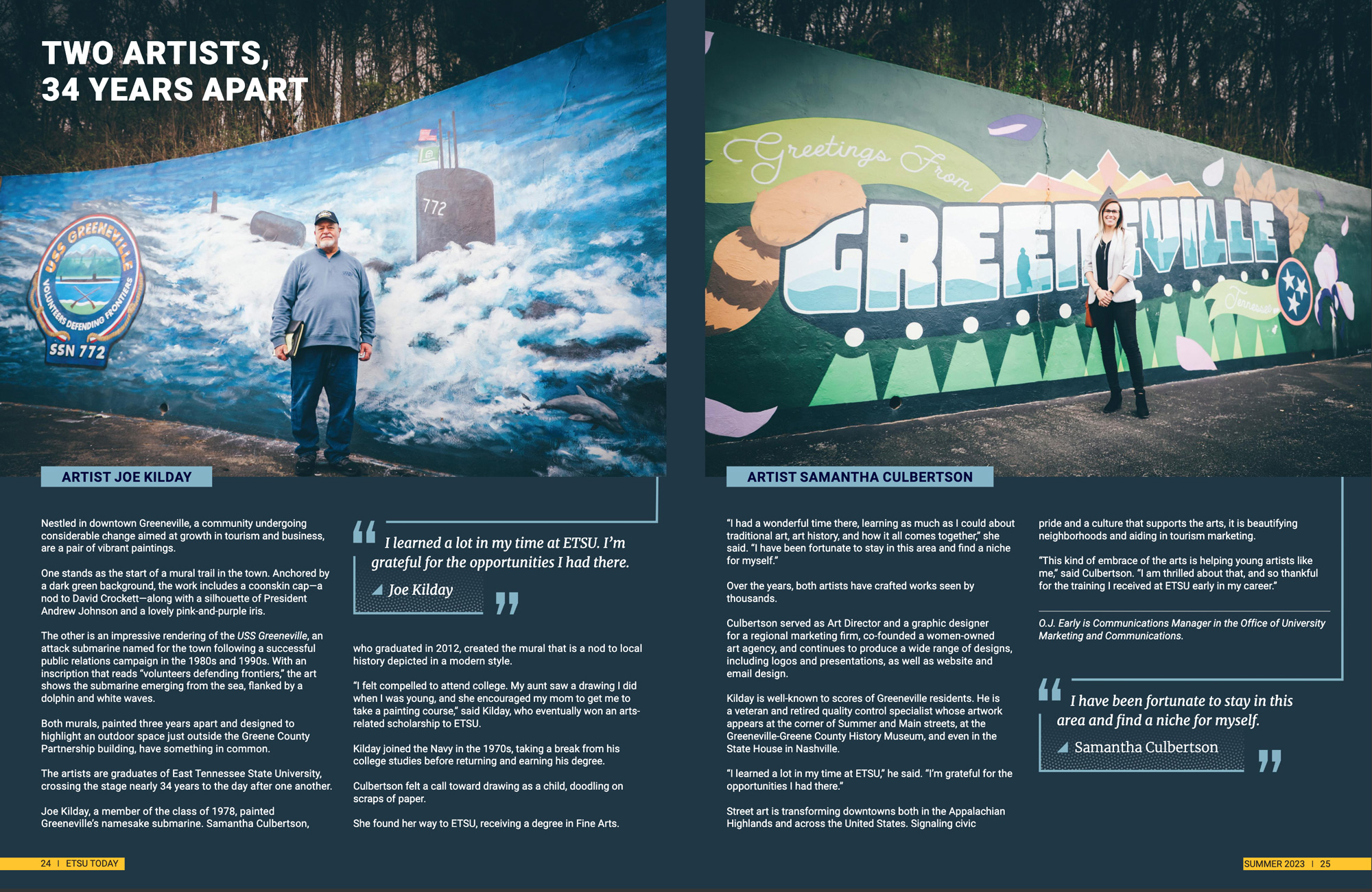
Read the Full Article by ETSU Today
Branding
Logo Design
Delicate, Abstract, Honest.
If you have met Tara Hodges you know these words describe her completely. When she first approached ARO about a full rehaul of her brand we talked for a long time about her goals in life and her business. She was at a turning point, ready to set her sights on destination wedding shoots all around the world.
In each step of the process, I kept her vision in mind. I aimed to communicate her goals, but also her personality and process for creating beautiful photography. She connects with her clients on a personal level and looks for those true and honest moments at every shoot.
I loved working on this branding project, and I’m extremely happy with the results! Thanks again for the opportunity, Tara! 📸
Branding
Logo Design
Professional, Dedicated, United.
The Dobyns-Bennett band program is a beloved part of the Kingsport community. The band program has won various national awards and participated in parades including 5 Macy’s Thanksgiving Day Parades, 4 Tournament of Roses Parades, 1 Presidential Inaugural Parade, and appearances by the concert bands in Carnegie Hall and at the Midwest International Band and Orchestra Clinic. The Dobyns-Bennett High School Marching Band is also a 3-time Band’s of America Grand National Finalist and the 2018 Class AAA National Champions.
The strength, tenacity, and talent that all students and staff bring to the program are unparalleled. The new logo highlights the program’s professionalism and unity. By utilizing musical iconography with a modern flair, this logo proudly showcases the band and their exceptional work not only to our hometown community but to the rest of the nation as well. Keep making beautiful music, DB! 🎺🎶
Logo Design & Branding
Marketing
Strong heritage, focus on family, and a vision to build on a foundation of innovation. “This is Kingsport” is a city-wide movement to celebrate and share 101 years of achievements, promises kept, and an inspired outlook. Through the implementation of a well-planned strategy, new and versatile branding, a brand video encompassing the vision, and a website to showcase it all, Kingsport is ready to share what makes it great.
Throughout this campaign conducted in partnership between ARO and the City of Kingsport, I led the visual design and branding of the new logo. The challenge was to create a modern mark that was visually friendly and welcoming, and inclusive of all the activities, opportunities, and people that make up this community.
I additionally led the website development, creating a “portal” to connect people to different types of City-wide activities. By working with focus groups, we determined the categories that were most intuitive and built a system to allow people to find opportunities quickly. The visual design further supports the campaign branding.
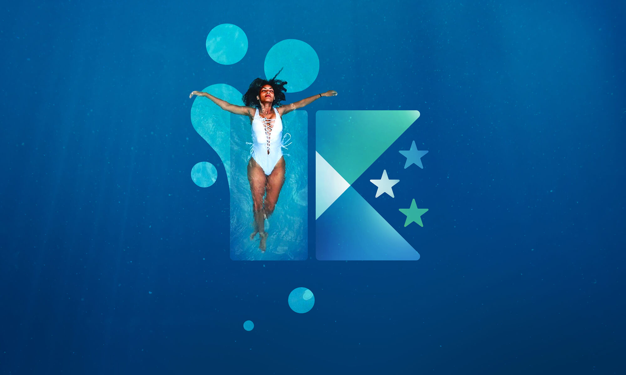
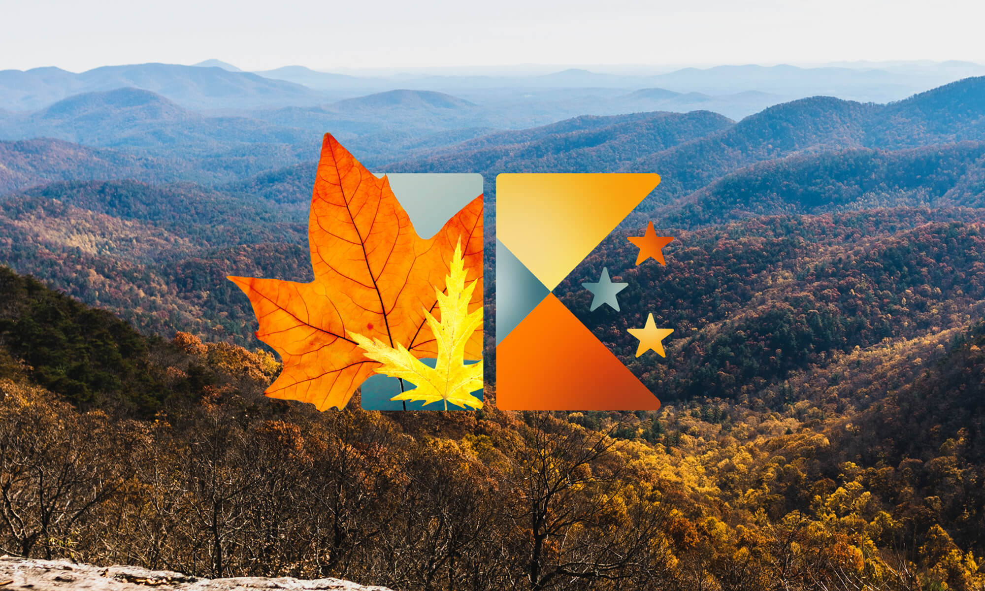
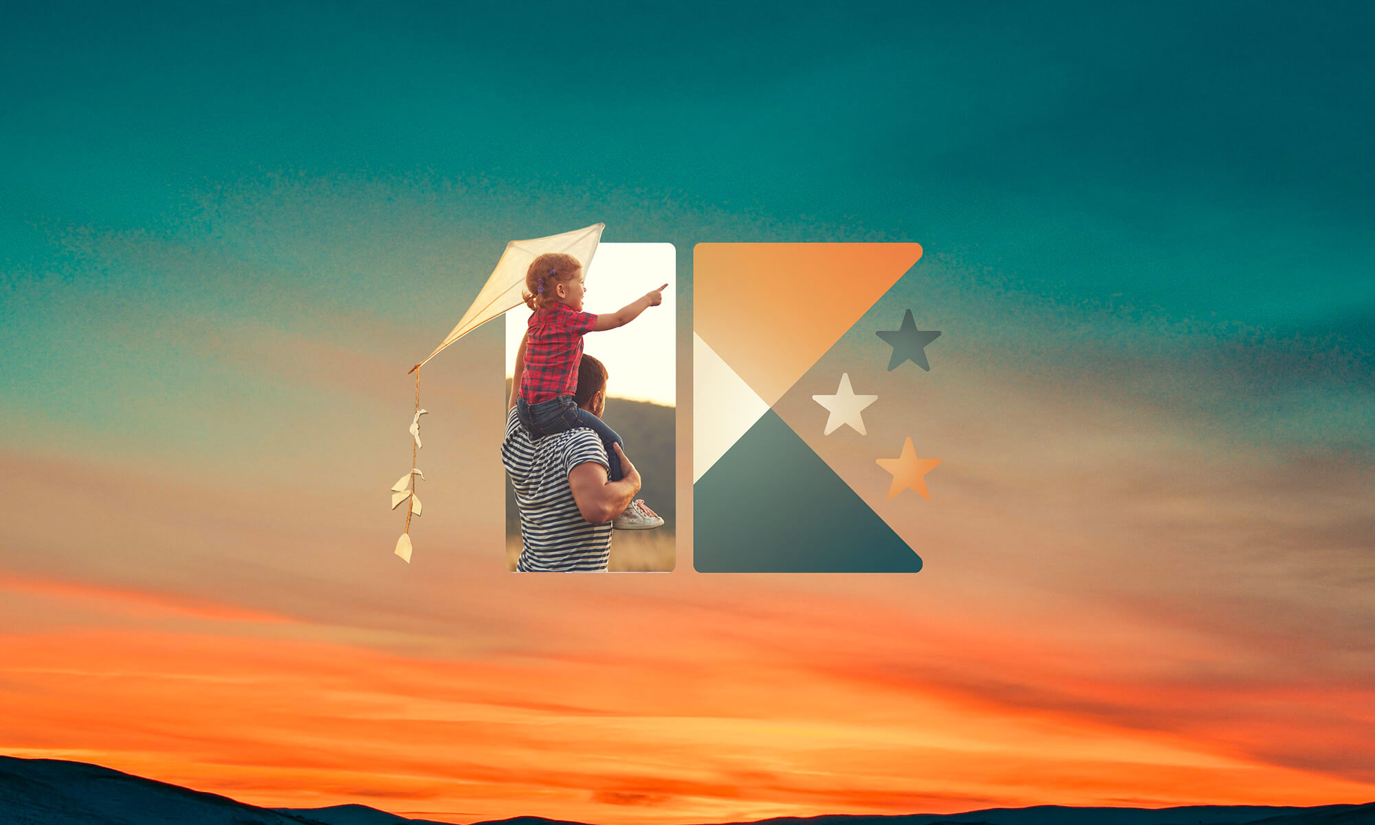
By keeping the marketing strategy front of mind, a visual system was created that allows for endless possibilities. Here’s a look at Kingsport. ✨
With vibrant colors and imagery, we highlight the exciting evens and activities Kingsport has to offer. Photography of people and graphics with overlapping shapes are utilized to keep things feeling light and energetic.
Our small-town charm is communicated through handcrafted elements, such as the custom illustrated logo versions for special events. Making the logo easily accessible by providing a text-only version as well brings additional ownership to the citizens.
The act of everyone coming together to work towards the betterment of the City should be celebrated. We emphasize this positivity with the visual tone, bright colors, light and legible fonts, and photography of happy and accepting people.
An underlying tone of economic development and innovation is communicated in the branding. By using bold, modern font styles and clean layouts, we present our city as sophisticated, technologically advanced, and business-friendly.



Over 15 City partners and local agencies worked together to provide services, support, and overall optimism to make this project a success. It was an honor working alongside so many dedicated individuals who all shared a common goal, to help show the world what Kingsport has to offer.
The Kingsport Chamber of Commerce was so supportive of the campaign and brand they elected to make it the official theme of their 73rd Annual Dinner.
We combined the logo system with an illustrated jazz music style to match the amazing band “Party on the Moon” that performs every year.
Posters, invitations, the program, and more additional assets were all created for the annual event.